Tuesday 3 May 2011

Evaluation

Here is my magazine front cover next to the front cover of my style model 'Top Of The Pops' magazine. This makes it easier to see how I have followed the normal conventions of pop magazines as I have written below.


In what ways does your media product use, develop or challenge forms and conventions of real media products?
Overall, I think my magazine mostly does follow conventions, especially on appearance purposes. For example, I have used lots of doodle-like pictures such as love hearts on the front cover and lots of stars on the double page spread. If you look at magazines such as 'Top Of The Pops' - which is my style model - they often use doodles and cartoon-like pictures to fill in spaces on the page and generally make the page look slightly more over-top and perhaps even a bit cheesy, because this is how pop music tends to be stereotyped. Pop magazines are usually quite girly looking and are much more appealing to females, and I think that anybody looking at my magazine would easily be able to decode this. In addition to this, and once again in relation to 'Top Of The Pops' magazine, the titles on the front covers of both my magazine and 'Top Of The Pops' are fairly similar. This was not a form of copying, but simply the font that my target audience chose in the survey that I handed out. I also found a preferred colour scheme through the survey that I gave out, but I had to change this slightly because the colours didn't blend or go as well together on the pages as I had first thought, which caused my magazine to look incomplete. I have kept the background of my front cover and contents page white, which is common of a lot of magazines because it does not attract the attention away from the main focus of the main which should be the cover star. The only way in which my magazine has not followed the typical conventions of a pop magazine is the image I have chosen for the front cover of my magazine. You would normally find a close up of a celebrity's face on the front cover of a pop magazine, but I have chosen to use a full-body image of my celebrity leaning forwards towards the camera with her head slightly tilted. This gives the cover a fun edge and would perhaps make someone looking at it look twice because it looks a bit different to the norm.

Who would be the audience for your media product and how does your media product represent particular social groups?


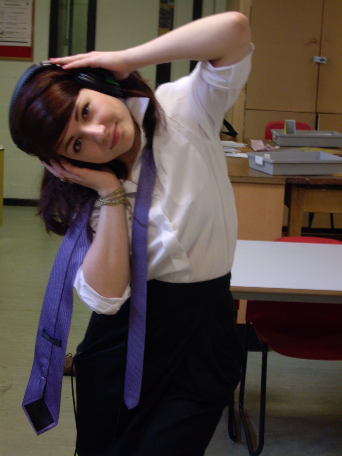
Here is an example of someone who is likely to be a part of my target audience.
As you can see, my target audience are young girls between the ages of about 10 and 15.
They will still be at school and this is reflected within the image on my front cover and the images on my double page spread which consist of my model dressed in a school uniform. This represents her quite innocently and perhaps as being slightly naive because she is fresh out of school with little experience, which my target audience would be able to relate to. They are likely to have a general interest in music that is in the charts rather than any type of indie or folk style music. They are likely to be interested in anything that is fashionable and popular. For example, new fashion trends or new hairstyles or even certain television programmes.
Finding a specific target audience for my magazine was quite hard because through my research I discovered that pop magazines are declining and so they have a narrower spread of target audience. Less people tend to be interested in reading about music because they can just easily log onto the internet and find information and listen to the type of music they like. Therefore, the content of pop magazines has converted to something broader, including much less information about music and much more about fashion and celebrity relationships (as stated in previous posts). This means that the target audience of pop magazines is once again slightly broader, but there is still the worry about further decline.

Here is an example of someone who is not likely to be a part of my target audience:

It is clear that this person would not be a part of my target audience because he is not female and he is not between the ages of 9 and 15. He looks as if he would rather perhaps read a newspaper or a different magazine of his choice which have a target audience of middle-aged men.


How did you attract/address your audience?
Below is a short interview I carried out with a member of my target audience to find out her interests and what exactly it would be that would attract her to my magazine if she were to see it in a shop.


What kind of institute might distribute your media product and why?
My magazine is all about what is popular and fashionable, whether it be music or fashion or relationships (despite the magazine being described as a "pop" magazine) and so I think it is likely that it would be produced and distributed by a large institution which specialises in magazine production. For example, institutions such as 'BBC Magazines' which is the owner of 'Top Of The Pops' magazine or 'Bauer' which produces some of Britain's biggest selling magazines such as "TV Choice" and "Take A Break".
I think my magazine would be distributed to all of the main-stream stores that sell magazines such as Tesco, Morrisons, Sainsbury's (all large-chain supermarkets) as well as stores such as WHSmith and smaller newsagents.


What have you learnt about technologies from the process of constructing this project?
During my preliminary task, I learnt how to use an advanced SLR camera to take some simple photos, but unfortunately, I did not have this camera to take the photos for my final product, so I just used a fairly basic digital camera. This seemed to work just as well as the SLR cameras though, and I was able to edit some of the photos I was unhappy with using Adobe Photoshop. Before I began this process I was totally unaware of how to use Photoshop, and although I am still no technical genius, I have a little more knowledge and was able to edit my pictures successfully in the exact way that I wanted to. As my main source of information, I used the internet, which provided me with a lot of useful facts, especially about the decline of pop magazines as well as allowing me to extract facts and figures from 'The National Readership Survey'.
Looking back at your preliminary task, what do you feel you have learnt in the progression from it to the full project?
Well, as I previously said, I have definitely learnt how to use computer programs such as Adobe Photoshop. For example, if I was given the preliminary task again, I would have used a totally different computer programme to make it. For the preliminary task I used Serif to make my pages, which I was really unfamiliar with, but for the main task of producing the music magazine, I used Microsoft Publisher because I am much more familiar with that and can use it confidently. I have also learnt that the magazine page is not going to look perfect in it's first draft form. For the pre-lim task, I only did one draft of each of the pages whereas I have done 3 or 4 drafts of my magazine pages for the main task. I feel as if I put a lot more effort into making my magazine look more professional for the main task, mainly due to having more time but also because I did so much more research into the make up of pop magazines and the particular font styles and image styles they use so that I could successfully follow conventions.

Thursday 28 April 2011

Evaluation Ideas

For my evaluation, I have decided I want to combine several ideas to make the whole thing more interesting and interactive. I know that I definitely want to produce some sort of video but I'm not sure whether I want to make a video of one of my teachers talking about my magazine, or whether I want to video a member of my target audience whilst I interview them and gain some feedback about what they would expect from a magazine and what they think of the magazine I have produced. If I do decide to interview my teacher, then I will still include something about my target audience. For example, I could take a picture of a member of my target audience and then take a picture of someone who really wouldn't be my target audience. The only problem with having a video containing one of my teachers talking about my magazine is that neither of them are my target audience so it may not be relevant. Sayint this, they could just give some information about the make up of my magazine, the house style, whether it can be easily decoded and whether or not it follows conventions.
Alongside the videos and photos, I think I will probably include some bullet points answering the necessary questions for the evaluation just so that I can make sure I have the right amount of detail that an evaluation really needs.

Wednesday 27 April 2011

Alterations to DPS

I have made the alterations to my double page spread that I said I would make on my last post, and now I just need some feedback from my teacher and my peers to see if they think it looks better or worse now than it did before.

Tuesday 26 April 2011

Things to work on from feedback.

I have been through and looked at my work with my peers and a teacher and we have come to the conclusion that I should keep my front page and contents page as they are because they really represent and follow the main conventions of pop magazines. The thing that I need to work on now is my double page spread because there is something about it that doesn't look quite right. We couldn't actually pin point an exact aspect but we thought maybe the use of text box around each section of text is what is making the magazine look less professional. So I am going to try taking the text boxes and the purple colour away and perhaps putting the text in a brighter colour with just a white background to see how it looks. I have some concerns about having a plain white background, because this is what I had on my contents page and it just looked too plain and boring and not colourful enough for a pop magazine. I am willing to try this though and get more feedback when this is complete. If it does not look any better than it does now, then I will have to re-think and come up with another way of making the magazine look more professional and less like a magazine made by a student on Microsoft Publisher.

Monday 25 April 2011

Changes to contents page.

Here are the changes I have made to my contents page. As I have previously said, I thought the contents page looked a lot plainer than it really should do and I thought I should may add some colour to the background or the text boxes, so that is what I have done and I think that it looks a lot better and resembles a pop magazine much more than it did before.

Further ideas...

I decided that I was going to leave my magazine construction alone for a few days and then come back to it because I often find that if I am working on something for too long I come to a dead end and can't come up with any other ideas. So now that I have come back to it, there are some considerations and extra ideas I need to take into account.

1. I think the contents page looks quite plain and bare because a lot of it is white, so I perhaps need to change the colour of part of the page (maybe the title? or just make the background a colour other than white).
2. The double page spread also looks slightly boring and perhaps not as "poppy" or bright as a double page spread from a pop magazine should do. The layout is fairly boring and again, there isn't a huge amount of colour, so this may be something else I need to change.

I am very happy with the interview I have created though because I think it addresses all of the topic areas that a professional pop magazine would, such as the relationships of the feature artist and her particular style. I have also made the interview so that there is information about how exactly she got into singing, and as you can see in previous posts I decided that my feature artist (Sally K) could have been a winner of a singing competition which is similar to The X-Factor. I chose to do this because The X-Factor mainly promotes pop acts and there is always a lot of reception to the show when there are especially young singers on there. So I thought this would help to stereotype pop culture.
I am also much more happy with my front cover than I was before when it had the grey bordering at the top rather than the purple bordering. I think the grey bordering gave it a kind of "newspaper-feel" which can often give off a boring vibe - especially to the target audience of a pop magazine who are young and are often much more interested in celebrities and pop culture than issues of the world. I am almost certain that the front cover I have now will go on to be my final front cover but I would like some feedback from my teachers and peers before I go on to decide that for definite. I just want them to make sure that I am definitely following a specific house style and that everything I have done is stereotypically "pop" and that I am going about following conventions in the right way.

Wednesday 20 April 2011

Comment on these pleeeeeeaaaaase!

So here are my page creations so far. As you can see from previous blogs, I have drafted these several times, but now I think I am much closer to getting my final copy. I would really appreciate it if people could give me some feedback as to how I could improve the appearance of the pages and whether or not you think I need to change anything. Remember, it's supposed to be a cheesy, lively pop magazine, so if you don't think it resembles that description, please tell me! Thanks! :)


FRONT COVER!


CONTENTS PAGE!


DOUBLE PAGE SPREAD!


Saturday 16 April 2011

Further development of double page spread...


This is my double page spread design. It has changed slightly from the first draft I did because the first draft was really plain and it didn't look bright enough or poppy enough to be in a pop magazine, so I added in a lot more colour. I still think it perhaps looks a little plain, so suggestions from anyone on how to improve this and make it look better would be much appreciated!

Saturday 9 April 2011

Variation of front cover...

I decided to change the front cover of my magazine slightly just to see what a different version of it would look like, and so I have some options when choosing my final front cover. I chose to do this because I thought some of the colours on my other front cover perhaps looked a bit harsh and not-fitting (the red of the boxes) and it also made the structure and layout of the page look a bit stange because it made the boxes stand out so much. This front cover is a lot more "girly" looking, but it doesn't matter because my target audience is girls, and so they are probably going to be more likely to pick up a magazine with lots of pink and purple colours on it, because they are generally more feminine colours. My teacher commented that perhaps I should change the colour of the background instead of having it just white, but when I tried this out, I didn't think the magazine looked as professional or perhaps glossy. It also didn't look right because the text boxes and the box surrounding the title are white, and these didn't change with the colour of the background, making the whole page look strange and unfinished. I understand what was said about the amount of white on the page though, so I will probably try to fill up some of that space which other doodles/cartoons like the love hearts I already have on the page. Overall, I am not sure which front cover I like best yet, and I may even create another variation of it before I decide on my final one. I also thought that if I am having trouble decided, I could create another survey asking my target audience which of the front covers they preferred, because this will give me an even better understanding of what my target audience are looking for in a magazine.

Tuesday 5 April 2011

The beginning of my double page spread...

This is the basic layout for the first half of my double page spread. I want the colour scheme to be slightly different on the double page spread because it is the feature article, and so I feel it needs to stand out from the rest of the magazine. I am thinking of changing the border at the top to purple to pick out the colour of the tie my feature star is wearing and make it the page look brighter and more "poppy", just as I want the others pages to look as well. I was also given the suggestion that I could have half of the double page spread showing the star in her school uniform looking very innocent and excited that she had won the singing competition, and then on the other half I could have a photo of the star all made up, ready to go on stage, which would create a complete contrast between the two halves of the double page. The only problem with this is that I don't think I will have enough time to take these photos before the coursework deadline because the model I used is a girl from school and we only have a couple of days before the easter holiday, and then the coursework deadline is the week after that, so I won't have an opportunity to take the photos. But I can just continue with my original idea for the layout of the other half of the page and it should still work just as well.

Draft of contents page so far...

This is a copy of my contents page so far. Again, I think I need to change the colour of the grey borders, but I am still unsure of exactly what colour I am going to change them to. I think I may also need to add another photo below the 'Extras!' box because pop magazines generally tend to be jam-packed with photos and pictures of the celebrities, rather than more writing like a lot of rockier type magazines have. I think I may have overdone it with the use of cartoon pictures on this page, especially the flowers. I think a lot of doodle-resembling pictures are a good feature of a pop magazine but I have maybe used the same doodle/cartoon picture too many times in terms of the flowers on this page, so I will have to look for some different types of doodles. The colour of the flowers are quite weak too, so I think I need them to be a darker shade of pink to make them stand out slightly more.

Draft of magazine front cover so far...

This is what I have created so far for the front cover of my magazine. I have kept to the colour scheme that was preferred in the survey that I carried out, but I think I may change the grey border at the top of the page because it makes the whole cover look a bit duller than I really want it to be. It makes the cover look less "poppy" than a pop magazine should, and I feel as if I need to make it brighter to really catch my target audience's eye. So I may change the grey border to a blue border because this will really contrast with the red and pink colours of the title and hopefully make it a lot more eye catching. I also need to fill in a few of the gaps I still have left. For example, I need to add another photo into the 'Celeb Style Tips!' box and perhaps need to add some cartoon doodles into the box about 'Celeb Romance!' to just make the whole page look a lot more busy. I'm thinking I may also need to fade out the edges of some of the boxes because they look a bit harsh at the minute, but this is not something I am definitely going to do.

Monday 4 April 2011

Additions to double page spread interview.

I have decided that I want my feature star (Sally K) to have won a type of singing competition like 'The X-Factor', because this type of show generally supports the pop genre of music. Therefore, I have created a few more questions that I am planning to add into my interview...

TTP: But it all really kicked off when you entered the 'Britain's Young Singers' competition didn't it? What made you decide you wanted to enter into it?
SK: Well I first heard about it through school. Everyone in our music class got given a leaflet about it, and it just seemed like a really good opportunity. When I went to the first audition I didn't really expect to get through. I kind of just went to try out and see what happened. I never expected anything as huge as this to happen!
TTP: So what was the audition process like? Was it intense?
SK: Well the audition are much like they are for shows like 'The X-Factor", but they're obviously not filmed. It doesn't get intense until you get to the semi-finals really. Well, that's how I felt anyway, but I suppose that could just be because I didn't get my hopes up too much until the later stages. I just didn't want to feel really disappointed if I didn't make the final stage.
TTP: Once you had reached the final stage you must have been pretty excited though.
SK: Well, no, not really because Sasha - the girl I was up against - has an absolutely amazing voice and I would have been thrilled for her even if she'd beaten me. I became really good friends with her throughout the competition because we were always put into the same groupings and she's actually got a record deal as well now, which is brilliant. I'm not sure when her album is being released but I'm definitely gunna be buying it as soon as I can.


This will hopefully build up the story behind my feature star and give her more substance. If I still need more of the interview to fill up the double page spread I could possibly add in some questions about Sally K's fans or about whether or not she gets nervous when she performs live to huge crowds.

Tuesday 29 March 2011

The housestyle of my magazine.

Within my magazine, I am keeping a certain house style throughout the front cover, contents page and double page spread as I am following the typical conventions of pop magazines. I will be showing my particular housestyle by having a strip of grey bordering at the top of each page, and by keeping the titles of the each page in the same font. The font that I am using for this is "Neon"; Groovy, taken from dafont.com. Other writing that I put on any of the pages will be typed in the font style Trebuchet MS.
I am also sticking to the colour scheme red, white, pink and grey, although this might be slightly different on the double page spread because the feature articles in most pop magazines have a different colour scheme to make the particular artist stand out from the rest of the magazine to get more publicity.
I will be using lots of doodles/small cartoon pictures to fill up any spaces on the pages of my magazine so that it looks really busy and full of fun. For example, I have used lots of love hearts on the front cover because the main statement on the front stage is, "We're just friends", so the love hearts link into this theme of romance. I have also used a lot of cartoon stars because the magazine is based on pop "stars", so there is a link here, and builds up the cheesy, poppy feel that I am aiming for the magazine to have.

Evolution of Genres.

Evolution of genres are mainly associated with the film industry but can also be applied to music magazines. There are many different stages of genre evolution:

Prototype - this includes the seminal/original texts (for example, 'NME' in relation to music magazines). These establish the conventions of the text which are carried on for years onwards.
Classic - these include the typical examples of the genre which show the conventions perfectly. 'NME' is also a good example of this because it was one of the first rock magazines and so is the one magazine that has set the genres and is going to portray them perfectly. In terms of the type of magazine I am producing (pop), 'Top of the Pops' is probably the most classic example.
Parodic - this is when classics are made into comedies or spoofs. This stage can't really be applied to pop or any other style of music magazine and is only really used in the film industry.
Revisionist - this is basically the re-writing of conventions. Re-writing happens when the "classic" examples become boring, when it becomes less popular and when styles/ideologies begin to change. This stage of evolution can be easily linked to pop magazines because in recent years since the decline of pop magazines, their conventions have changed a lot. For example, pop magazines used to be totally centred around music and nothing else, whereas pop magazines are much more based on celebrity style or celebrity relationships (as addressed in previous posts) rather than purely music.
Hybrid - this is where lots of different genres are combined. For example, 'Q' magazine covers a wide variety of different music genres such as rock, pop, indie. This types of texts generally appeal to a wider mass audience. In terms of pop magazines, different genres of music are not so much combined but the interest in music of pop stars is combined with the interest in celebrity style and relationships etc.
Post-Modernism - this stage can be broken down into different types. For example, Bricolage is the combining of old elements from different cultures and different eras to form new things. This is often applied to style and the easiest example to give is when someone is wearing a 1950's jacket, has a 1960's haircut and then shoes from the present day (or something similar). Another type of the post-modern approach is Homage. This is usually a deliberate tribute to someone or something from the past. For example, you will often find that you listen to a song and it reminds you of another song you have previously heard. The artist of the new track may be aware of this fact and may have used it as a deliberate attempt to rediscover the previous track's exploration into music, or on the other hand they have possibly never actually heard the song from the past that the new track has been related to, meaning it's purely coincidence. This then relates to the theory of memes that I have touched upon on a previous post.

Thursday 24 March 2011

Photo Edits

Here are some of the photos edits that I have created so far on Adobe Photoshop. They are fairly simple, because I want the actual quality and look of the photograph to stay the same; I just needed to make the background white so that I can place just the model onto the front page of magazine without the background.


Confirmation of magazine title!

I have now decided that I am definitely going to be using 'Tip Top Pop' as the title for my pop magazine. This is because I think the title is very catchy and slightly rhythmic, which obviously has a relation to music. It is also a bit of a tongue-twister if you try to say it quickly, and so this kind of gives it an element of fun. The words within the title can also be linked with one of the most well known pop shows and pop magazine, 'Top of the Pops'. For example, I have still used the words 'Top' and 'Pop' but in a different word order and different phrasing to 'Top of the Pops', which somehow seems to give it a totally different feel and meaning.

Photos I have taken!

I have now done my main photoshoot and so I am going to post the ones that I am most likely to use on here. Some of the photos I have taken are quite serious and clearly positioned for the camera, whereas others are slightly more fun because I just asked my model to improvise. I did this because pop is generally quite fun and cheesy and happy, so I wanted an element of fun to come across in my photos.


As you can see, I have chosen to go for the "good girl" image for the celebrity in my photos because most young pop stars tend to try and stick to a clean, innocent image. Of course there are exceptions to this, and some seem to veer off and let loose (e.g. Miley Cyrus) in order to look this stereotypical image, but I have chosen to follow conventions and keep mine fairly fresh and clean. For example, the pigtails/bunches that my model is wearing her hair in connote goodness and perhaps purity because this is usually classed as quite a "young" hairstyle to have and a style that maybe primary and junior school children are likely to wear, suggesting innocence. This is also shown by the school uniform. Although the top button of my model's shirt is undone and her tie is hanging loose, she carries this off without it looking too rebellious by keeping a smile or a not-too-serious expression on her face, which makes you feel as if she is not purposefully wearing the uniform to go against rules or regulations that have been set, but to perhaps be a bit more casual and fun.
I will not be using these photographs as they are for my magazine, I will be editing them using Adobe Photoshop and then adding them into the pages of my magazine.

Tuesday 22 March 2011

Front Cover and Double Page Spread Photoshoot

Today I will be doing my photoshoot for the main photo on the front cover of my magazine as well as all of the photos for my double page spread/feature article pages.

Costume and Props
- White school shirt (tied up at the front)
- Black mini skirt
- Purple tie
- Knee high grey/black socks
- White plimsolls
- Pink nail varnish
- Big set of headphones
- Microphone (if accessible)
- Pink pen with feathers/bobbly bits on the end

I want to create a school girl image in my photos because the pop star who is going to be featuring on my double page spread is a young girl, fresh out of school who has managed to break into the pop industry.
I am aim to have one photo of my model sitting at a desk with a note pad and the pink fluffy pen in front of her, elbows on the table, daydreaming, with a big set of headphones on her head. This will probably be used for the main photo on my double page spread. For my front cover picture, I want the background to be totally white (I will have to create this on a photo editor such as Picasso or Picnik) and I want my model to be bending forwards towards the camera whilst holding the headphones onto her head. I also want her facial expression to be quite serious and perhaps a little sultry. I suppose the photos will be slightly edgy, but the edginess will be brought down a bit due to the fact the model will be wearing school uniform. This is how pop magazines often construct their photo shoots. For example, in a recent edition of 'Top Of The Pops' magazine, there was a Justin Bieber feature article and photo shoot where he has a very serious expression in all of the photos, but he is carrying books and a basketball with vaguely connotes school life, although he did not have the school uniform on. The element of schooling will come across much more obviously in my photos. School seems to be quite a common semantic field in pop magazines because a lot of the new artists tend to be very young and just out of school, so I am keeping to these conventions in my magazine. It is the ideal kind of age to base my artist on anyway, because I spend my days around lots people who fall into this age category, so I have a wider knowledge of exactly what kind of experiences the artists would have been going through, and I can include this information in the interview that I create on my double page spread.

Saturday 19 March 2011

Draft of double page spread interview/feature article

Tip Top Pop magazine is extremely honoured to introduce to you...

(Sally K in huge, bold font)

(Picture of Sally K bending forward to towards the camera and holding onto the huge headphones that cover her ears).

Here at Tip Top Pop, we feel super privileged to have nabbed the very first ever interview with dazzling new pop sensation, Sally K. As Sally's first ever single "Finding Love" storms the charts and keeps hold of the number 1 spot for its third week running, what Laura Hudson really wants to know is how this charming 16 year old girl, fresh out of school, managed to rise to fame so early on in life...

TTP: Morning Sally! It's so lovely to meet you and to have you hear at Tip Top Pop for your first ever interview. It must be daunting to be getting phone calls from magazines and radio stations left, right and centre begging for interviews with you, especially at such a young age!
SK: Thanks! I'm so excited to be here! Of course it is daunting to begin with, but it's amazing feeling that the UK want to know all about me already, despite me having only released one single so far.
TTP: Can I just say you are looking particularly gorgeous this morning. Very preppy!
SK: Oh thank you! What I'm wearing right now is actually the very first item of clothing I splurged on when I started earning money for my music. (Spreads arms out wide to allow Laura to admire the beautifully designed Mulberry cropped jacket). I'm not used to having such luxuries.
TTP: Ooh that must have been a real treat for you. Have you grown up in a family with little money then?
SK: I definitely wouldn't say we were a poor family, but we had to be quite careful with money because my Dad is a self-emplyed kitchen fitter. There are times when he gets loads of work and a fair amount of money, and then other times we're scraping it a bit. It's not like I was deprived in any way as a child. Not at all! I mean, we live in a semi-detached moderately sized house and my parents always worked their hardest to ensure me, my brother and my sister had a great upbringing, but some times were just harder than others; just like they are in all families.
TTP: A fairly average family then really? Have they had much of an input into your musicality?
SK: Well, my parents are mainly into stuff from the '70's and '80's, because that's the kind of stuff they would listen to when they were younger. And then my older brother has always been into more rock and indie bands. But we constantly had Radio 1 on in the house, so me and my younger sister have grown up listening to the charts and all of the new up-and-coming artists on that.
TTP: What about the school you have recently left? Did they have much of an influence on your decision to try and break into the music industry?
SK: They definitely aided me in my decision, yes. I started off in the choir when I first joined the school and then went on to perform a couple of solos in school concerts and things like that. It kind of felt natural to me I guess. I decided to go on and take music at GCSE level, and that's when the teachers become really interested and involved in pushing your musical talents.
TTP: And our secret spy (aka, your mum!) told us that you got an A* in music, you brainbox!
SK: Haha! Trust her to say that! Yes, I did, but only because I worked really, really hard. I suppose it affected some of my other subjects like Maths and Science because I didn't concentrate so hard on them, but it has helped me to get to where I am now, so I have to be grateful for that.
TTP: We've also heard that you've got a bit of a romance going on with fellow teen star James Bell. Can you confirm if these rumours are true?
SK: I've known James for a couple of years now, but we're just really good friends. We understand each other because we've both launched pop careers from a very young age and sometimes it feels like we've been thrown in at the deep end. It helps when you can talk to someone with similar experiences to you.
TTP: So definitely no romance? Just friends?
SK: Yes, just friends.
TTP: Is there anyone else on the cards that we don't know about though?
SK: No, seriously, there's no one. The main reason is because I literally have no time for boys at the minute. I'm so busy with making new music and promoting it that I don't have any spare time and it wouldn't be fair on whoever I was with.

... for now, I am going to leave this as it is, but as I begin to construct my double page spread and know the sizings of columns etc, I will be able to decide whether or not I need to add some more to the interview to fill up any extra space.
As you can see, I have based a lot of my questions on non-music related topics such as style (comment on her appearance) and love life (question about fellow teen star) to show how the content of pop magazines have evolved and are now much less music based.

Risk Assessment of main photoshoot location

My main photoshoot is going to take place in a classroom because the pop star I am interviewing is fresh out of school and new to the music industry, so I am planning on having her wearing a school uniform and standing on a school desk, singing into a microphone.

Therefore, I need to ensure that the tables she will be standing on are sturdy and not wobbly so that there is little chance of the table causing her to wobble and fall. I also need to make sure that any other people in the room are out of the way so that there isn't a chance of her being knocked or pushed, causing her to fall off the table and possibly injure herself. Sharp objects such as chair legs or perhaps pens and the prongs of plugs need to be out of the way in case a fall occurs, to prevent any major type of injury. Although I do want my model to be posing in some way whilst she is standing on the table, it needs to be a sustainable position so that she is not struggling to hold it and she so that she doesn't stagger and fall.

Tuesday 15 March 2011

Tropes and Memes

Tropes
A trope is a recurring element which is repeated over time and forms a common convention.
For example, we can pick up on the typical vampire tropes:
- They can't go out in the sun/ their skin burns in sunlight
- They sleep in coffins
- They have extremely pale white/grey skin
- They are allergic to garlic and crucifixes
- They can be killed with stake through the heart
- They can transform into bats and wolves
- They wear long black capes

More recently, these tropes have evolved as vampires have been introduced back into the film industry. For example,
- They no longer burn in the sun, they just sparkle
- They have super strength and super speed
- They feed off animals to get rid of their thirst for human blood, and sometimes they don't feed at all (this is the complete opposite to what vampires used to be like)
- They live in the normal world with normal people
- They're not only seen as monsters but people who blend into society

This can be related to pop music because it typically has ideological tropes such as being non-sexual, focusing on love rather than
hate, being clean and fresh and quite cheesy. Nowadays, it has evolved just like the vampire tropes have and it is now much more sexual, perhaps due to influences from different genres such as R'n'B or hip hop and also due to changes in society. For example, people are much more aware of sex these days, and are less likely to be shocked by anything they hear in song lyrics. In addition to this, the tropes of pop magazines used to completely revolve around the music that new pop artists and bands were producing, and nothing more. As pop magazines have become less and less popular and begun to diminish, the tropes have acclimatized (just as the vampire ones did) to suit their target audience's preferences. These days, pop magazines such as 'Top Of The Pops' have tropes which largely involve celebrity relationship gossip and celebrity style information, which is a total contrast to the solely music-based tropes of the past.

Memes
A meme identifies ideas or beliefs that are transmitted from one person or group of people to another. Memes are like the "genes" of culture and often somehow appear in the media simultaneously without given reason. For example, Pixar released the film 'Finding Nemo' and several weeks later Dreamworks released the film 'Shark Tale', which was immensely similar, yet there had been no connection or copying of content between the two. It was totally unexplained. In the music industry, Lily Allen and Kate Nash came about at the same kind of time and their general sound was fairly similar. They both had the "Mockney" style of singing which really emphasized the fact they were both from London and had Cockney accents. In addition to this, they both had fairly controversial and rude song lyrics, which was completely new to the pop industry and had never been explored before. These type of ideas become memes which eventually form tropes. For example, there are now the likes of Eliza Doolittle and Jessie J who are similar to Lily Allen and Kate Nash to a point.


Monday 14 March 2011

Deconstruction of possible titles

Several of my titles have the word "pop" in them. The word "pop" is monosyllabic and begins with a plosive which makes it seem as if it's bursting with energy and and quite in your face.
"Pop" is a contracted form of "popular" and also fits in with the modern trend of shortening words, which we tend to do with most things (e.g. R'n'B is a contracted form of rhythm and blues).
The title "Tip Top Pop" kind of relates/reminds me of the sixties, which is when pop music properly came about (with the likes of The Beatles etc), so this has a definite relevance to my magazine, and is probably the title I am most likely to use. "Tip Top Pop" also has a rhyming kind of ring to it, which can link in to the pop style of music because pop songs are stereotyped for having a lot of rhyming words within the lyrics, unlike some other music genres such as indie or perhaps rock.

Tuesday 8 March 2011

Possible titles for my magazine

As I am producing a pop magazine, I am quite convinced that the title of my magazine needs to be fairly cheesy and slightly cliche. Pop magazines (and almost every other type of magazine) tend to have titles which relate to their particular genre. For example, 'Top of the Pops' and 'Smash Hits'.

Here are a few title ideas I have come up with so far:
- Pop It!
- Hit Pop
- Music Now
- Chart Buster
- Tip Top Pop!
- No. 1
- Teen Pop
- Pop Tart!

If I struggle to decide on a name for my magazine, I could possibly set up another survey so that people can vote on their favourite title, or I could even set up a survey simply asking for possible titles, just to give me a broader range of choice. The title of a magazine is extremely important because it is one of the main factors which affects whether or not a person actually picks up the magazine. The title needs to be catchy, "poppy" and fun to ensure an excellent reception and a high level of consumption. The more people that buy the magazine, the further afield the magazine can be distributed as well as allowing more money to be put into the production and marketing of it.

Ideas for photos and locations

Front Cover
I need lots of different images covering different topics on my front cover, so here are a few photos for ideas of the kind of thing I want to be shown, e.g. celebrity relationships, celebrity style.
For example, I will include this photo (or something similar) on my front cover because my target audience have stated that they are interested in finding out about celebrity relationships, and so this type of picture needs to be clear on the front page of the magazine.
I am also planning on taking some more photos showing a desired celebrity style, and I will add this to my front cover too.

Contents Page
The contents page needs to contain photos from further on in the magazine. So for example, there will be a photo of a celebrity and then the page number that the particular article can be found on will be listed below. I could use some of the photos I have used on the front cover, but I would prefer for all of the photos I use to be different because it makes the magazine look much more professional as a whole. I just want the contents page to give a clearer idea of what the magazine includes through the use of photographs, because this is often all that the readers look at, rather than the writing. To fill in any gaps on both the front cover and the contents page, I will be adding in doodle-resembling pictures such as love hearts, stars, flowers and swirls because these will link in with the kind of cheesy, poppy feel that the magazine needs to have.


Double Page Spread
Here are some very basic ideas for the photos for the double page spread of my magazine. I had the idea that the artist being featured in my article will be a young girl straight out of school that won a singing competition like 'The X Factor' and is featuring in her first feature interview/article. I had the idea that the photo shoot could take place in a classroom and the artist could be dressed in a school uniform which is styled to look cool (undone top button, tie hanging loosely, short skirt, knee high socks, little plimsolls). I want her to be standing on a table and singing into a microphone. This will be the main/largest picture on the double page spread. I have not yet decided on a model to play the part of the young, new artist, but I have a vague idea of what I want her to look like.


Thankfully, this is not the photo I will be using as I will not be modelling for my own magazine, but I want my model to be in the same kind of positioning (maybe a bit more confident looking and her body more open to the audience) whilst wearing a school uniform to show that she is fresh out of school and straight into the music business.


This is the type of setting/location I want my photoshoot to take place in. I think this type of environment will really relate to my target audience (young girls) because they are all still school students and by having a celebrity being a part of a photoshoot in a classroom, this gives the girls hope or maybe even faith that they too could be lucky enough to breakthrough and achieve exactly what they want to, just like my feature celebrity will have done.

Another photo I could have is a close up of the young star's face holding a pen and daydreaming while listening to head phones and looking longingly and hopefully at a poster advertising the singing competition that she eventually went on to win. Towards the end of the article, I would have a picture of her holding up her debut single with a huge grin on her face and looking very happy.

Monday 28 February 2011

Summary and Evaluation of my Research and Planning

The first part of our coursework task was the preliminary task, which consisted of us producing a fairly simple front cover and contents page for a school magazine. I took pictures in locations around my school to fit in with the theme of promoting education as well as healthy eating (see water and apple in photo) and having fun. I was not very confident with the production of my prelim as I have never used computer programs like Serif before, so I was unsure of how to use the software. I found it quite easy to get to grips with the simple tools but I was wary of the more complicated/advanced tools and so the final product didn't look as professional or "real" as I perhaps hoped it would. So before I start to produce the pop magazine, which is the main part of the coursework task, I need to have a lesson learning how to use the programs properly so that I can create the best possible looking magazine I can.
Within my research, I have looked at many different aspects which affect the production and publication of magazines. For example, we looked at how different genres of magazine appeal to different genders and to different age groups and who exactly their target audience is. I also looked at the conventions of certain magazines and how some magazines choose to subvert conventions despite the fact that a lot of magazines don't tend to sell very well this way. This has allowed me to conclude that the pop magazine that I am going to produce will definately follow conventions rather than subvert them. We then moved on to research into semiotics and how certain signs and looks can denote one thing but connote something completely different.
My research helped me to decide that I want to produce a pop magazine for the main part of my task because it covers some very interesting topics such as the decline of pop magazines. This has enabled me to create extra blogs and to also gain a greater understanding and idea of exactly what a pop magazine should look like. Although most pop magazines have declined and been abolished in recent years, 'Top Of The Pops' magazine is still being sold monthly, and so I have decided that I am going to structure the basic framework of my magazine around this style model.

Media Theories

We have covered several different media theories within our media lessons, the most common and dominant being the Uses and Gratifications theory. This theory suggests that media influences people depending on the way they personally react to it rather than its influences being forced upon them. The audience supposedly take an "active role" is what they are perceiving, unlike the passive audience associated with the Hypodermic Needle theory (where the audience believe and follow everything the media says).
There are thought to be four main headings which can be grouped within the Uses and Gratifications theory:
  • Information - media helps to increase/gain knowledge of specific subjects
  • Personal Identity - media allows/helps one to find oneself
  • Integration and Social Interaction - perhaps liking a certain aspect within the media text to fit in or connect with others.
  • Entertainment - media could perhaps allow the audience to relax, release emotions or have fun.

There are several other perhaps less common theories which we have also studied:

Cultivation/Drip Drip Drip Effect - the audience becomes affected by the repetition of a certain message within a media text.

Two-step flow - the media introduces us to certain ideas and prospects and then we go on to discuss these with others and form our own opinions.

Limited effect - the idea that nothing in the media affects us because we are so used to everything that it has already thrown at us.

Media dependancy - the theory that suggests we as humans need media to thrive and to live.


How do these theories apply to music magazines?

The two most applicable theories are the Uses and Gratifications theory and the two-step flow theory, as they apply to the majority of people. For example, most people make up their own minds and form their own opinions about exactly what they see or read in music magazines, rather than being 'spoon-fed' everything. If everybody mindlessly followed and gave in to believing exactly everything that the media said, then we would have a very narrow minded and powerless society. The Hypodermic Needle theory is probably the least applicable theory because it is a discredited and outdated view of media which is overly simplistic, and it really doesn't apply to music magazines. The Limited Effect theory and the Media Dependancy theory can apply to music magazines, but not very regularly, and usually only to a small percentage of people. For example, the Limited Effect theory applies to people who are seriously devoted to music, because the magazines are more likely to have effect and sway the opinions of them. The Media Dependancy theory perhaps applies more to people who are always buying or subscribing to magazines and a huge part of their life revolves around music and celebrities.

Media Survey/Questionnaire

I have produced a survey to hand out to ten girls who are in year 7 (the average age group of my target audience) to find out exactly what they look for in a magazine, or what they would want a pop magazine to contain.


I chose to make my questions quite detailed about specific things such as font and colour scheme because this helps me to gain an idea of what my target audience want the entire magazine to look like, rather than just the contents of it. It will now be easier for me to pick out the detail within the front cover, contents page and double page spread because I will take the idea/selection which gets the most positive feedback in response to my questionnaire.

Below are the results from my survey:


Colour scheme B consists of the colours red, white and pink, and so these are the main colours I am going to be using for my magazine. This will generally make the magazine look quite girly, which is perfect, because my target audience is girls.


There is a clear preference for Font C on this part of the questionnaire and so this is definately the font I will be using for the title of my magazine and also a lot of the headings within my magazine.

Within this part of my survey, there was not one feature box that was not ticked when I brought all of the 10 surveys together. This will allow me to pick up on all of these features within my magazine, although I'm not sure if I will include anything about male celebrity style because this was the least popular feature and now that my survey is complete, I'm not really sure if writing about male celebrity style would fit in with my magazine's conventions.


This was the type of result I expected to get, because as my previous blogs have addressed, pop magazines have recently declined, so I expected gossip and lifestyle to be the more popular option. My magazine will still only feature music artists, but it will be focused more on their lifestyles, fashions and relationships, rather than the music they are making.

Thursday 24 February 2011

Mock up of magazine


This is the basic layout I want my magazine to have. Although this may change slightly when I begin to produce my magazine (depending on how it all fits into the space), I want to try and stick to these conventional structures as much as I can. I want each page to look quite "busy" and full of lots of photos and doodles (heart, stars etc). This will help to make the magazine look cheesy and cartoon-like and fit in with the pop theme. I want everything to be based around the main feature article - the celebrity being interviewed needs to be the main focus on both the front cover and the contents page (as well as obviously the double page spread). I want to use lots of photos to make it obvious that the magazine is very style/looks-orientated. This seems to be the way that pop magazines are conventionally laid out and structured, and so I have decided to stick to this method of production.