 I have chosen to analyse 'Mojo' magazine because it is in many ways similar to 'Q' magazine (which I have already analysed) and this is the style of magazine that I want to reproduce when it comes to producing my coursework piece.
 'Mojo' is a monthly magazine which was first published in 1993 by a company called Emap. 'Mojo' continued to be published by Emap up until 2008 when it was taken over by the publishing company Bauer. The very first issue of 'Mojo' magazine displayed Bob Dylan and John Lennon as its front cover stars, in keeping with the general rock theme that goes with the magazine.
The magazine's typical content consists of a main feature article on either a band/artist or a particular genre of music. A significant different between 'Mojo' magazine and 'Q' magazine is that 'Mojo' magazine tends to have a lot of articles and information about artists from the past and more classical rock acts such as Jimmy Hendrix. Because of this, you would expect the typical audience of 'Mojo' to perhaps be the elder generation of men, but the National Readership Survey from October 2009-September 2010 proves that although the majority of readers are men (200,000), most of the readers are between the ages 15-44 (136,000) compared to the over 45 age category (64,000). The contents of 'Mojo' magazine tend to include a lot of long, wordy articles which means it appeals more to the percentage of the population who are in the ABC1 category. 'Mojo' is almost likeThe Observer or The Guardian of music magazines - it appeals to the upper classes. The National Readership Survey shows that 130,000 'Mojo' readers are classed as the ABC1 population, whereas only 69,000 readers would be placed into the C2DE category.
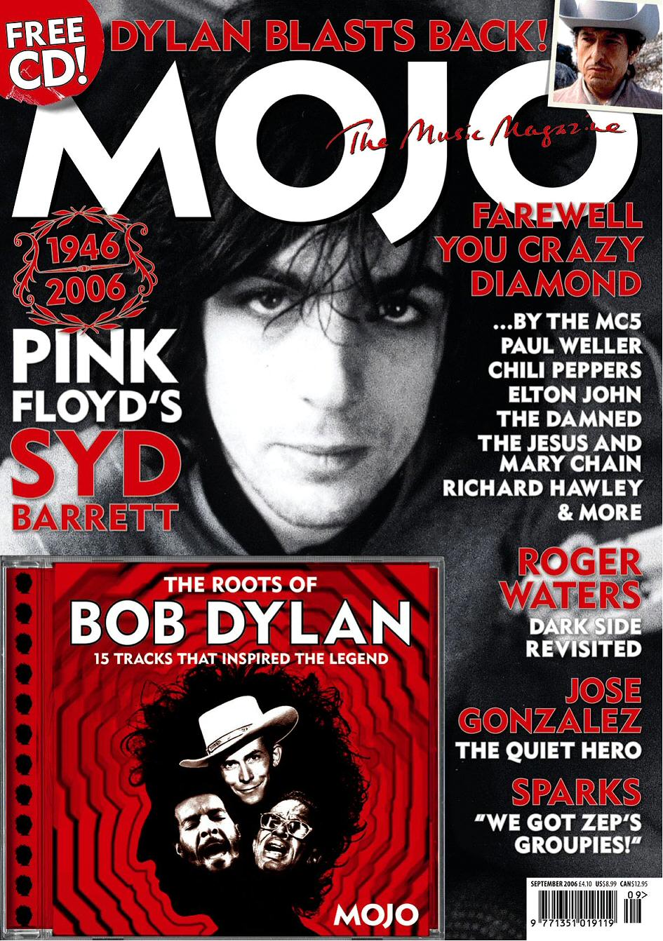
The colour scheme of 'Mojo' magazine is a consistent black, white and gold throughout, with the main title on the front cover being in bold, black font on a white/grey background. The more recent issues of 'Mojo' have featured the main band/artist on the front cover in black and white rather than in colour, perhaps to relate to the way that previous eras of music are often written about within the magazine. Furthermore, part of the title on the front page is always partially hidden by the feature artist/s. Just in the same way that 'Q' magazine does it, 'Mojo' prints its name on the corner of every page next to the page number so that the brand name is repeated throughout. Another similarity between 'Q' and 'Mojo' is that 'Mojo' can be found in shops such as Tesco, Asda, Morrisons, WHSmith and HMV, just as 'Q' can.
The social groups that would tend to read 'Mojo' are represented as fairly well educated, upper class people. This is mainly displayed through the way in which the articles are all quite long and written in complex ways, which perhaps not the entire population would completely understand. I personally think that the magazine also gives the impression that the social groups that read it are very keen on "old-school" rock and would brush aside or shun any of the new styles of rock that are out in the charts or played on the radio nowadays.
Laura, I'd like to discuss your analysis of Mojo magazine in relation to a project I'm working on.
ReplyDeleteThanks,
Andy - Little Matey Productions
littlematey@gmail.com
What is your project exactly?
ReplyDelete